tower-pattern show-room responsieve teksttegel staand
Responsief wil onder andere zeggen dat de lay-out zich automatisch aanpast aan de stand van het apparaat. Als het apparaat staand wordt gehouden moet de vorm en de volgorde van de tegels automatisch aangepast worden.
Probleem
In de staande toestand moeten twee zaken in de lay-out gewijzigd worden:
- de volgorde van de tegels: de minder belangrijke tegels moeten naar onderen verschoven worden;
- het aantal tegels op één rij moet worden verminderd;
Oplossing
- Om te detecteren of het toestel in staande of liggende toestand is, gebruiken we een media-query. Al naargelang staand of liggend maken we aangepaste stijlregels voor
show-roomentile.In de desbetreffende media-query stellen we de volgende eigenschappen in Vincent: omdat ik meer gebruik heb gemaakt van percentages, zal het er een beetje anders uitzien. Zie beneden.:.- Liggend:
@media (orientation: landscape) { .show-room.index { display: flex; flex-wrap: wrap; flex-direction: row; } .show-room.index .tile { height: 11em; flex: 1 0 17em; } .show-room.index .tile:nth-child(3) { flex: 4 4 22em; } .show-room.index .tile:nth-child(4) { flex: 2 2 12em; } .show-room.index .tile:nth-child(7) { flex: 2 2 12em; } .show-room.index .tile:nth-child(11) { flex: 2 2 8em; } } - Staand:
@media (orientation: portrait) {
    .show-room.index {
        display: flex;
        flex-wrap: nowrap;
        flex-direction: column;
    }

    .show-room.index > .tile {
        height: 10em;
        width: 98%;
    }

    .show-room.index .tile:nth-child(3) {
        order: 8;
    }

    .show-room.index .tile:nth-child(4) {
        order: 9;
    }

    .show-room.index .tile:nth-child(7) {
        order: 10;
    }
}
- Liggend:
- De rest van de attributen blijven staan waar ze staan:
/* show-room tegel */ .show-room.index { width: 100%; } .show-room.index .tile { margin: 0.5em 1% 0 1%; color: white; display: flex; align-items: center; justify-content: center; flex-direction: column; /* all the last times by mierlagypsy */ background-color: rgb(195,94,77); overflow: hidden; text-shadow: 2px 1px #0c0c0c; } .show-room.index .tile:last-child { margin-bottom: 0.5em; } /* de link tegels hebben een andere achtergrondkleur */ .show-room.index a.tile { background-color: rgb(222, 184, 135); } .show-room.index a.tile:hover { color: rgb(249,246,244); /* orange red peach spring wood */ background-color: rgb(65,74,76); /* outer space */ } .show-room.index .tile [class^="icon-"] { font-size: 8vh; } - Met flexbox is het een fluitje van een cent:
- om het aantal tegels op één rij te verminderen naar één, veranderen we richting waarin flexbox de elementen plaatst:
- om de volgorde te veranderen gebruiken de mogelijkheid van flexbox om de volgorde aan te geven waarin de tegels geplaatst moeten worden:
- Wij maken de layout die we al hadden mediaspecifiek als volgt:
.show-room.index {
    display: flex;
}

.show-room.index .tile {
    margin: 0.5% 1%;
    color: white;
    height: 11em;
    display: flex;
    align-items: center;
    justify-content: center;
    flex-direction: column;
    background-color: rgb(195,94,77);
    overflow: hidden;
    text-shadow: 2px 1px #0c0c0c;
}

@media (orientation: landscape) {
    .show-room.index {
        flex-wrap: wrap;
        width: 100%;
    }
    .show-room.index .tile {
        flex: 1 0 23%;
    }
    .show-room.index .tile:nth-child(3) {
        flex-basis: 48%;
    }
}

@media (orientation: portrait) {
    .show-room.index {
        flex-direction: column;
    }

    .show-room.index .tile:nth-child(3) {
        order: 8;
    }

    .show-room.index .tile:nth-child(4) {
        order: 9;
    }

    .show-room.index .tile:nth-child(7) {
        order: 10;
    }
}
Gebruik
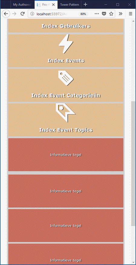
Resultaat
De tegels staan allemaal onder elkaar en de informatieve tegels zijn allemaal onderaan gegroepeerd:
HTML
<nav class="control-panel">
    <a href="/Home/Index" class="tile">
        <span class="icon-menu2"></span>
        <span class="screen-reader-text">Home</span>
    </a>
    <h1 class="banner">Fric-frac</h1>
</nav>
<section class="show-room index">
    <a class="tile" href="/Person/Index">
        <span class="icon-group"></span>
        <span class="screen-reader-text">Index Personen</span>
        <h1>Index Personen</h1>
    </a>
    <a class="tile" href="/Country/Index">
        <span class="icon-earth"></span>
        <span class="screen-reader-text">Index Landen</span>
        <h1>Index Landen</h1>
    </a>
    <div class="tile">Informatieve tegel</div>
    <div class="tile">Informatieve tegel</div>
    <a class="tile" href="/Role/Index">
        <span class="icon-group2"></span>
        <span class="screen-reader-text">Index Rollen</span>
        <h1>Index Rollen</h1>
    </a>
    <a class="tile" href="/User/Index">
        <span class="icon-user"></span>
        <span class="screen-reader-text">Index Gebruikers</span>
        <h1>Index Gebruikers</h1>
    </a>
    <div class="tile">Informatieve tegel</div>
    <a class="tile" href="/Event/Index">
        <span class="icon-lightning"></span>
        <span class="screen-reader-text">Index Events</span>
        <h1>Index Events</h1>
    </a>
    <a class="tile" href="/EventCategory/Index">
        <span class="icon-tag"></span>
        <span class="screen-reader-text">Index Event Categorieën</span>
        <h1>Index Event Categorieën</h1>
    </a>
    <a class="tile" href="/EventTopic/Index">
        <span class="icon-tag-stroke"></span>
        <span class="screen-reader-text">Index Event Topics</span>
        <h1>Index Event Topics</h1>
    </a>
    <div class="tile">Informatieve tegel</div>
</section>
CSS
html {
    width: 100%;
}

/* Tower Pattern */
.tower {
    font-family: Verdana, sans-serif;
    width: 100%;
    background-color: rgba(249, 246, 244, 0.9);
    margin: 0;
    padding: 0;
    box-sizing: border-box;
    -moz-box-sizing: border-box;
}

.floor {
    width: 90%;
    opacity: 0.9;
    margin: 0 5% 0 5%;
    background-color: rgb(204,204,204); /* zilver */
}

.control-panel {
    display: flex;
    justify-content: flex-start;
    height: 11%;
    background-color: rgb(250,240,230); /* linnen */
    padding: 0 1em 0 0;
}

/*
    controle paneel icoon tegel
    opmerking: Viewport-percentage lengths: the ‘vw’, ‘vh’, ‘vmin’, ‘vmax’ units
    The viewport-percentage lengths are relative to the
    size of the initial containing block.
    When the height or width of the initial containing block is changed,
    they are scaled accordingly.
    However, when the value of ‘overflow’ on the root element is ‘auto’,
    any scroll bars are assumed not to exist.
    Bron: http://www.w3.org/TR/css3-values/#viewport-relative-lengths
*/
a.tile {
    text-decoration: none;
}

.control-panel .tile {
    margin: 2px;
    padding: 4px 4px 0 4px;
    /* indien masker word het absoluut geplaatst hierop*/
    position: relative;
    overflow: hidden;
    background-color: #3b444b; /*arsenic*/
    font-size: 6.5vh;
    color: rgb(249,246,244); /* orange red peach spring wood */
    align-self: center;
}

/* standaard hover kan overschreven worden door ander schema */
.control-panel .tile:hover {
    color: rgb(226,69,16); /* realgar */
    cursor: pointer;
}

.control-panel .banner {
    margin-left: auto;
}

@media (orientation: portrait) {
    .show-room.index {
        display: flex;
        flex-wrap: nowrap;
        flex-direction: column;
    }

    .show-room.index > .tile {
        height: 10em;
        width: 98%;
    }

    .show-room.index .tile:nth-child(3) {
        order: 8;
    }

    .show-room.index .tile:nth-child(4) {
        order: 9;
    }

    .show-room.index .tile:nth-child(7) {
        order: 10;
    }
}

@media (orientation: landscape) {
    .show-room.index {
        height: 89%;
        display: flex;
        flex-wrap: wrap;
        flex-direction: row;
    }

    .show-room.index .tile {
        height: 11em;
        flex: 1 0 17em;
    }

    .show-room.index .tile:nth-child(3) {
        flex: 4 4 22em;
    }

    .show-room.index .tile:nth-child(4) {
        flex: 2 2 12em;
    }

    .show-room.index .tile:nth-child(7) {
        flex: 2 2 12em;
    }

    .show-room.index .tile:nth-child(11) {
        flex: 2 2 8em;
    }
}

/* show-room tegel */
.show-room.index {
    width: 100%;
}

.show-room.index .tile {
    margin: 0.5em 1% 0 1%;
    color: white;
    display: flex;
    align-items: center;
    justify-content: center;
    flex-direction: column;
    /* all the last times by mierlagypsy */
    background-color: rgb(195,94,77);
    overflow: hidden;
    text-shadow: 2px 1px #0c0c0c;
}

.show-room.index .tile:last-child {
    margin-bottom: 0.5em;
}
/* de link tegels hebben een andere achtergrondkleur */
.show-room.index a.tile {
    background-color: rgb(222, 184, 135);
}

.show-room.index a.tile:hover {
    color: rgb(249,246,244); /* orange red peach spring wood */
    background-color: rgb(65,74,76); /* outer space */
}

.show-room.index .tile [class^="icon-"] {
    font-size: 8vh;
}

/* accessability */
.screen-reader-text {
    /* Reusable, toolbox kind of class
voor screen readers, op die manier
kunnen de readers lezen waarvoor
de knop staat; de tekst is zelf
niet zichtbaar op het scherm door negatieve
waarden toe te kennen aan top en left */
    position: absolute;
    top: -9999px;
    left: -9999px;
}
2018-01-14 13:50:36